Field Studies & Task Analysis
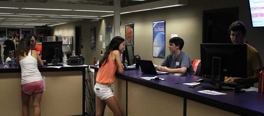
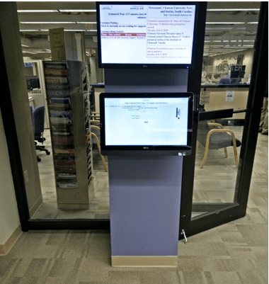
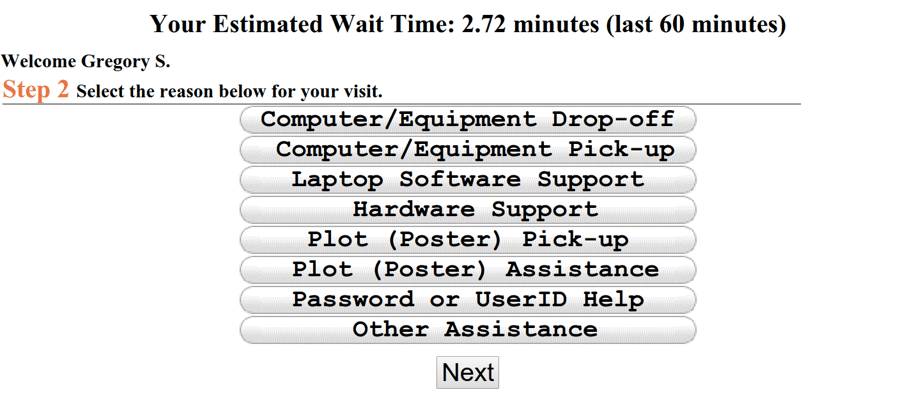
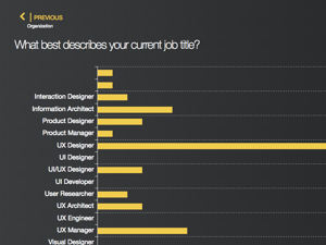
Queuing systems are prevalent in almost any location where numerous people gather to receive a good or service. While these systems are necessary in order to manage the flow of customers in locations where demand for service exceeds the supply of available employees, users generally dislike being required to wait in a queue. To begin our project, we conducted qualitative field observations and user interviews at the CCIT Support Center in order to discern common friction points of students and faculty alike when using the current queue system. Through our time observing, we found that a majority of the users completely disregarded the kiosk altogether, and had to be instructed by CCIT staff to sign in before being seated. Users also generally had a hard time diagnosing a reason for their visit, so much so that the system frequently timed out before they could register an answer.
I was really confused when I got to the page about choosing the reason for my visit. A lot of the category names were really technical. Also, two of the categories were really similar, so I had trouble deciding which one to pick.
— A user interviewed during the field study
Iterative Design Sprints
Once we had a more sophisticated understanding of how the current queue system functions, and where any potential gaps lie, we set about redesigning it. As we weren't bound by technical constraints, we were allowed to experiment further and more deeply with little thought to how feasible the recommendations we were offering were. We began by mapping out the journey and identifying all the various touchpoints the user was likely to encounter with the CCIT Support Center on a given day. As our round of field studies showed us, users who frequented the center varied greatly, from students to faculty, and for many, English was not their first language. With that in mind, we relied heavily on sketches and paper prototypes in the beginning, only gradually moving to higher levels of fidelity after iterative rounds of guerilla testing at the Center during off-hours (a quote from one of our participants can be seen below). We identified three main device types we wanted to design for to illustrate how the system would work: Kiosk/Touch Display, Mobile App, and Smartwatch. We then used the task analysis to determine functionality the system needed to address, including: making a reservation on-the-go, managing queueing and availability, sign-in and authentication, and supporting multiple languages.
The important information pops out more in the paper one...especially if you added color.
— A user we interviewed during guerilla testing
Smart-Scheduling Delivery Mechanism
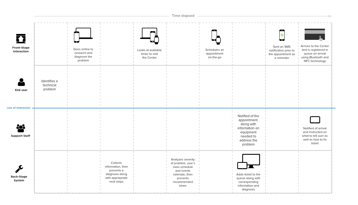
As the aim of the project was to try and innovate using a view of the future imagined 10-20 years from now, we envisioned the system taking things a step further by using artificial intelligence and machine learning to quickly learn the users' habits and weekly routine, with the help of commonly accessible data stored in university databases like class schedules, scheduled intramural sports and athletics events, and University football games. While also managing support on the backend and keeping a log of when the Center was busiest, the system would then be able to generate recommended times to the user that avoided peak hours and accorded with the severity of the diagnosis made and the estimated level of effort involved. Notifications would then be used to remind the user of scheduled appointments in advance, and a combination of Bluetooth and contactless NFC technology would be used to register the user once they arrived onsite at the Center. There is also an administrative dashboard that keeps written record of the current queue and tracks any dependencies needed to fill upcoming tickets. Below we mapped out a service blueprint of all the different touchpoints we were designing for, which would come in handy later.
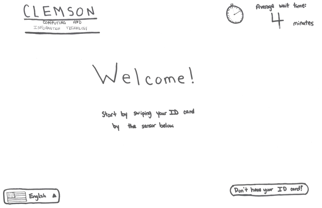
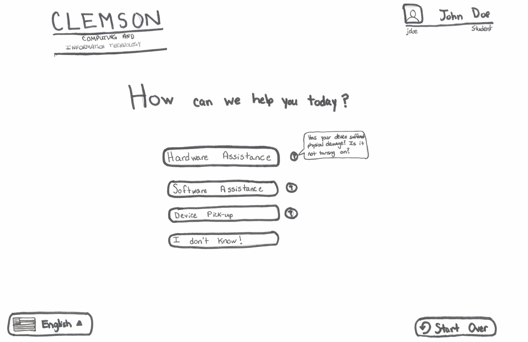
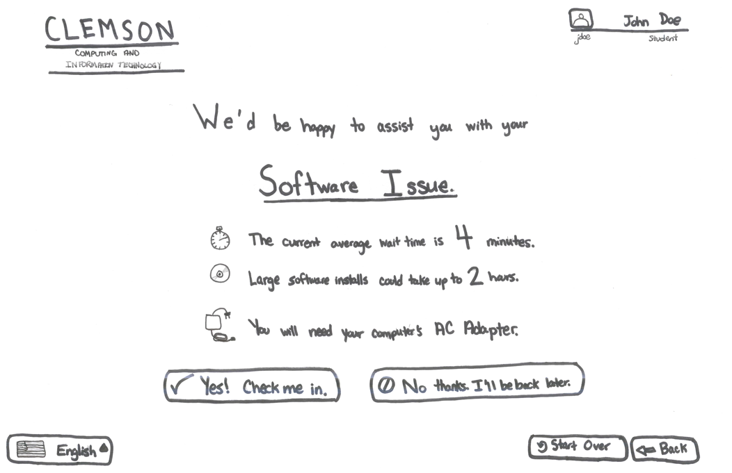
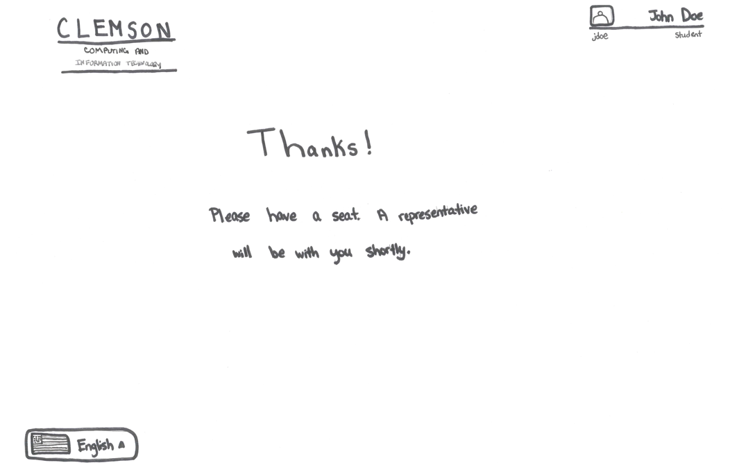
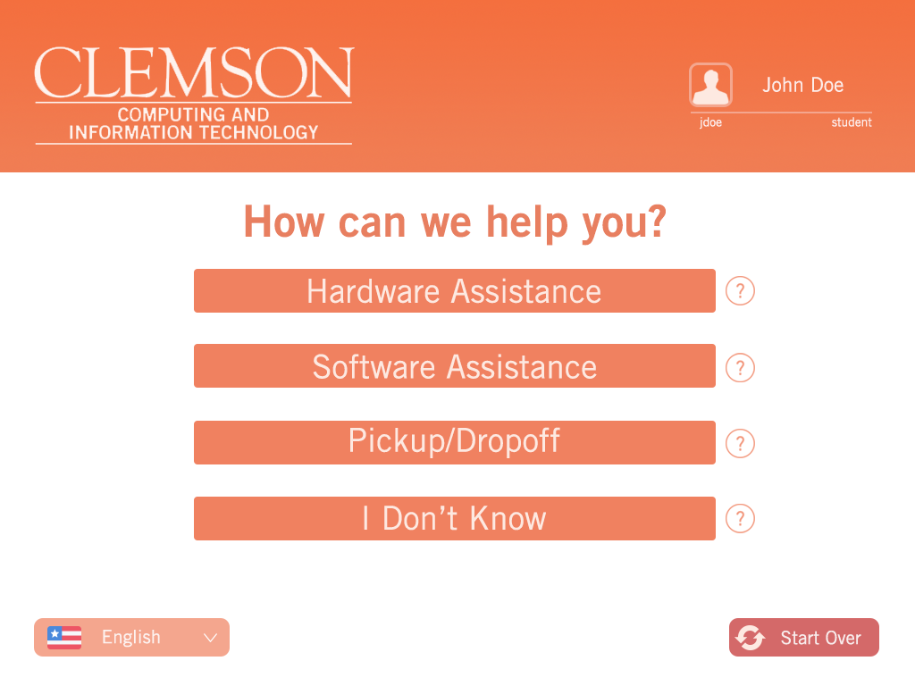
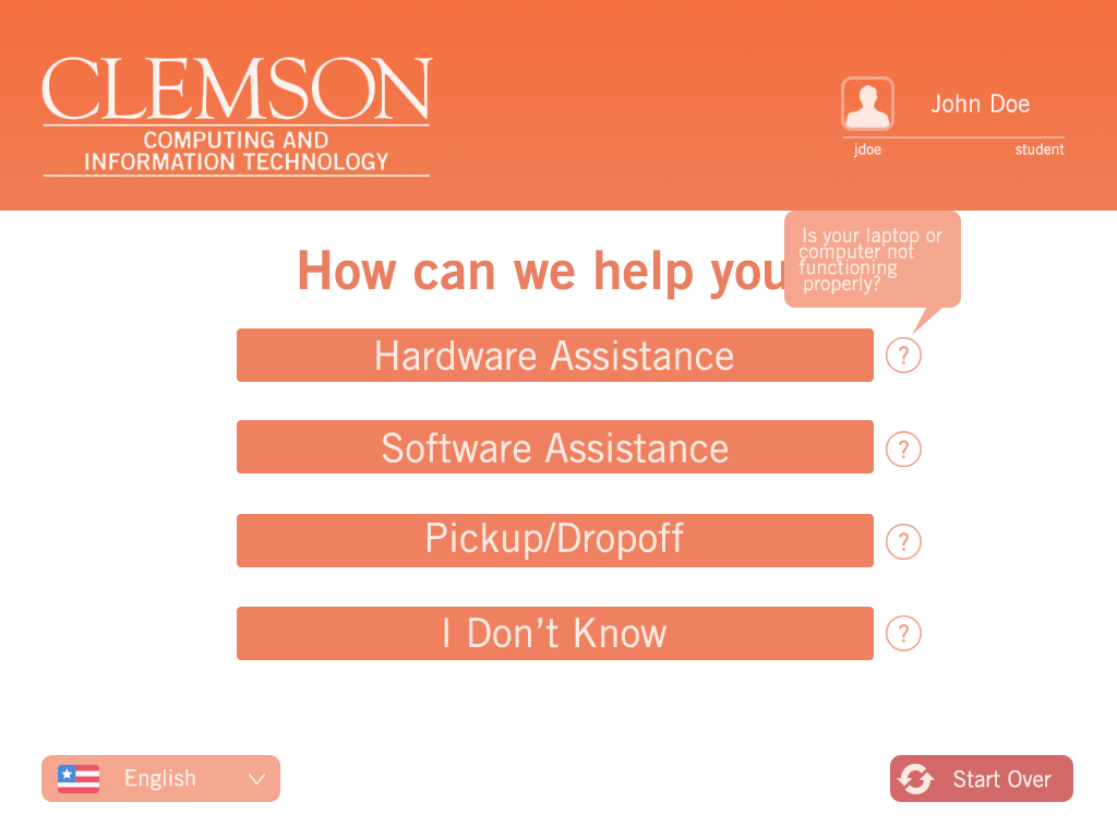
Redesigned Kiosk
When it came time to produce a higher-fidelity deliverable, I took the initial sketches and wireframes we'd validated and began comping out each screen using Sketch and Adobe Illustrator. As this was still a University application that would one day become part of the my.Clemson suite, the final design had to adhere to branding and style guidelines mandated by the School of Computing. As this kiosk greets users immediately as they enter the Center and is the first touchpoint they're likely to interact with upon arriving, we employed large, tappable buttons and clear, inviting language throughout. Special attention was also paid to the nomenclature and taxonomies used to report and diagnose problems, and tooltips were provided with each entry to further alleviate confusion.
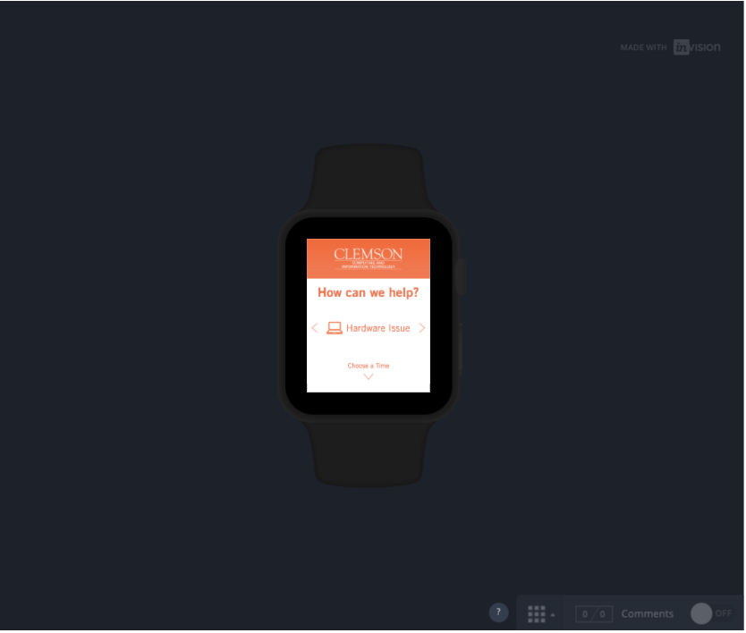
Mobile and Smartwatch Companion Apps
These same design principles and system were carried over to the mobile and smartwatch companion apps, and we created an InVision prototype to share during our final presentation. The prototype offers a sampling of the system's smart recommendations feature and a glimpse at how it might learn the user's behavior and schedule over time. After presenting to our class, we turned over the deliverables we'd created to CCIT for later use in a redesign they'd already been planning. While some features are obviously probably a bit too aggressive for the School to implement right now, like smart recommendations and the beacon network needed to detect guests upon arrival to the Center, here's hoping they don't remain on the drawing board for too long.