Collecting Data
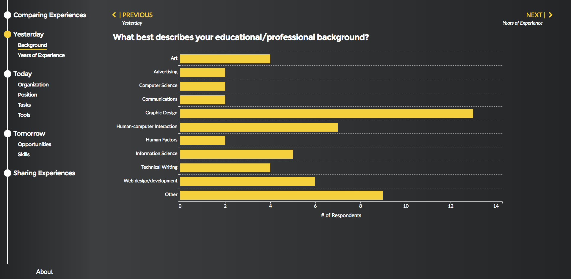
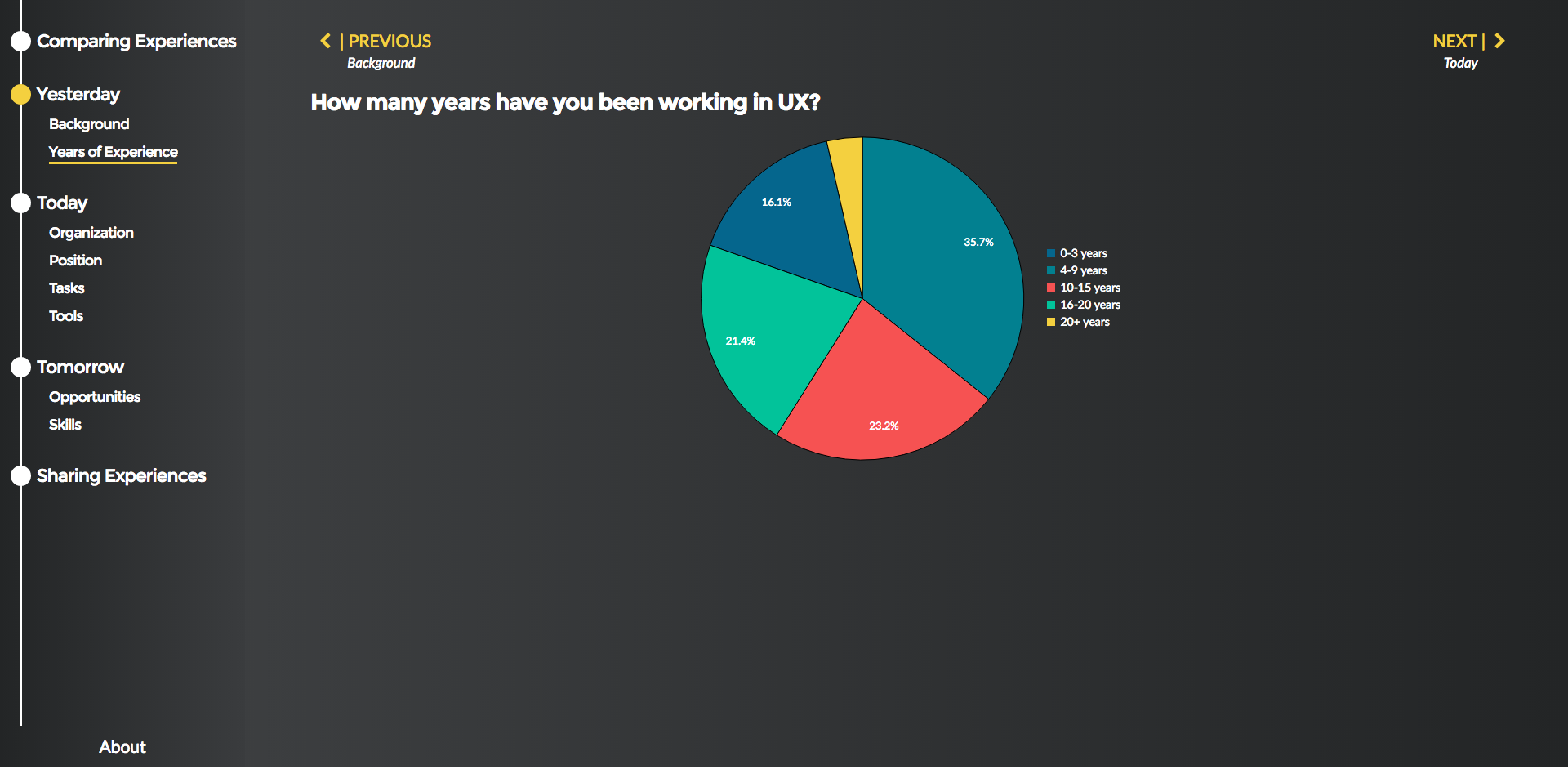
Our data visualization was fed by a survey that was administered both shortly before and during poster night (with the help of a QR code) to conference attendees and people in the field. We collected responses using Google Forms, and a workaround method which basically took and converted that information into a raw CSV format that was more manageable for us to chart later. The survey was broken down chronologically into topics related to past, present, and future, intending to cover where and how attendees began their careers, what skills they currently possessed, and how they saw the field evolving moving forward. As such, we led with demographic questions first in order to to establish a baseline before leading into more speculative territory.

Real-Time Data Visualization
Our setup used D3.js (by way of a charting library, C3.js) to create the dynamic models and graphs that would visualize and render the survey data as it populated. Visualizations were then organized and styled using a Bootstrap framework and some jQuery. In order to aggregate in real-time, we needed to set a recurring call to the server to be made every five minutes, so that the dataset we were using would update as the night went on and as more attendees answered our surveys.
Presentation & Findings
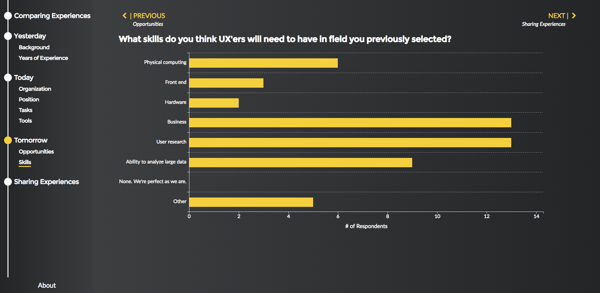
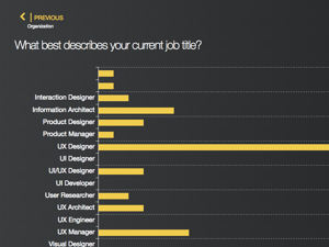
For poster night, we were given a space in the conference area to present to passerby, where we projected our presentation both on a pair of display monitors behind us as well as on tablets each of us were carrying for when people grew closer. In terms of the survey itself, perhaps the single greatest takeaway for me was how diverse everyone we met was, and how starkly different both their backgrounds were as well as what drew them to the field in the first place. I was also a bit surprised at how most attendees viewed the field evolving in the future and what skills practitioners would need to adopt to survive, as foundational competencies like user research and business strategy still won out over other candidates like physical computing or hardware expertise. I guess this shows that, no matter how much the field may evolve going forward, UX'ers would do well never to stray from the core strengths that have gotten us where we are in the first place.
Don't just take my word for it though, feel free to make your own findings and play with some of the models we made here.